sign design
Serving the Greater Phoenix area including Glendale, Goodyear, Chandler, Scottsdale, Gilbert, Peoria, AZ
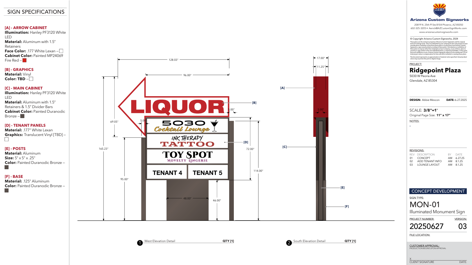
A well-designed sign should be visually appealing, communicate what the business offers at a glance, and capture the attention of potential customers. It should also clearly convey key information while reinforcing brand awareness. Every element—from color and font selection to logo placement and lighting—must be thoughtfully planned to maximize the sign’s impact and the owner’s return on investment.

CONSIDERATIONS FOR GREAT SIGN DESIGN
A company’s brand often uses certain fonts for recognition and familiarity, but a font should be easily readable above all. Complicated or overly ornate fonts should never be chosen where readability is important. For example, a sign right next to the road should be readable at a glance because drivers have little time to safely stare at a sign while trying to decipher what it says. When font choice is part of the brand, a compromise between recognition and readability must be reached. Cluttered signs are harder to read, so spacing and font size is just important. The sign should also have just enough verbiage on it to get the point across and no more.
Truly great sign design is about finding the balance between functionality, branding, and aesthetics. Choosing the right fonts, colors, material, and lighting choices while taking the main purpose of the sign into consideration will ensure the best design possible. At Arizona Custom Signworks, we know how to do all of this while also remaining compliant with local and federal regulations.
Before sign design even begins, you must know the sign’s purpose and who its target audience is. A retail sign should get people to come in off the street, for example. An informational or directional sign like those found in a hospital should prioritize accessibility and be clear in meaning. Knowing the main purpose of the sign and the demographic it’s geared toward ahead of time shortens the time it takes to design, and it enhances the sign’s effectiveness.
Perhaps the most important facet of your sign design is color and font choice. Aside from the colors your brand is normally associated with, colors can be used to energize, as in the bold colors like red and yellow which are often used in sale signs, or calm and relax, like the blues, greens, and greys found in healthcare facilities. ADA compliant signs often use high contrast colors to increase readability for those with visual impairments. All public spaces should be ADA compliant to foster inclusion and safety.
The material a sign is made of should be able to blend in with the surrounding architecture as well as match the aesthetic of the business it represents. If the sign is outdoors, the materials should be able to stand up to the local climate and be water resistant. If a certain look can be created with a more durable material, a faux-wood grain on a metal housing instead of actual wood for example, we’ll pick that option.
Many signs incorporate lighting if the sign needs to be seen at night. A lit sign is an easier to read sign. Most signs today use LED lighting as it’s much more reliable and uses less electricity than older types of lighting. If a sign is going to be lit indirectly, you must determine where you can place lights to shine on the sign and how they are going to be powered.
Some of your signs must meet ADA regulations, like those for restrooms, ramps, exits, and so on. To be compliant, some of these signs may need to include Braille translations, raised lettering, easy to read fonts, and be placed within strict guidelines so those with visual impairments know where to look or feel for them. This not only fosters inclusion, but also protects you legally.
Why Choose Arizona Custom Signworks?
We specialize in creating high-quality, custom signage that stands out. From design to installation, we ensure your signage meets your needs and exceeds expectations. Our team uses top-of-the-line materials, making sure each sign is durable and visually appealing. With Arizona Custom Signworks, you can trust that your business will be represented in the best light possible. Experience superior service and exceptional results with our expert solutions.


